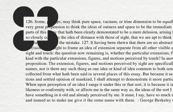
Apart from seeing the missing sections of these 4 dark disks as the sides of the square (some will even perceive the square as brighter than its surroundings), as well as perceiving the vague contour lines of a square that doesn’t actually exist, this picture holds another great optical illusion. When the brain sees an image like this, it interprets depth relationships to perceive the square as set on top of black disks – as a result, the inside of the square is perceived as being closer to your eyes than its surroundings, ultimately creating visual illusion that makes you think the area within the square is enlarged! How about that? This non-existent square becomes a magnifier magnifying the text behind it. This specially works for spacings above and below each word inside the rect. See it? More similar interactive examples can be found in this Mind Lab presentation. Enjoy!

Interesting. I suspect it works by clearing the noise around the immediate text. Makes me wonder if something similar would be helpful to aid reading.
Actually, that now reminds me of reading aid tools I used to see for masking a book, so the reader could look at only a single line at a time.
Lame. The text used is providing the lion’s share of this “illusion.” Numbers take up considerably more line space than do lower cased letters, as do most capital letters.
The “effect” some might see here would all but vanish if the four disks were moved elsewhere. Not one of the best OIs.
That’s epic!
Very clever but I think the words are all the same size!
Confusing
That’s impressive!
awesome
Nice illusion and I agree, could be developed into a learning/teaching aid. Major…. knob!
that’s a poor illusion. the text is the same colour the words are the same size. That’s not an illusion in my opinion.
also works if you look at an object through your awn hands. Nice to finally know what causes this.
It’s SCARY
Like Sonic.exe? :^(
I dont get it
That’s cool.
This is a very classy one. I don’t see the space between the 3/4 circles brighter, but I perceive it as a square and the text seems enlarged. I also noticed the almost hidden “p” letter at the top-right angle of the non-existent square looks as if it’s lower than the other “p” on the same row (after the black 3/4 circle). But I guess it’s a countereffect of the illusory enlargement.
Vurdlak what’s your phone number ;)